
03/11 / Cinema
← CinemaRomulusOpening titles - design and animation
Opening titles, design and animation
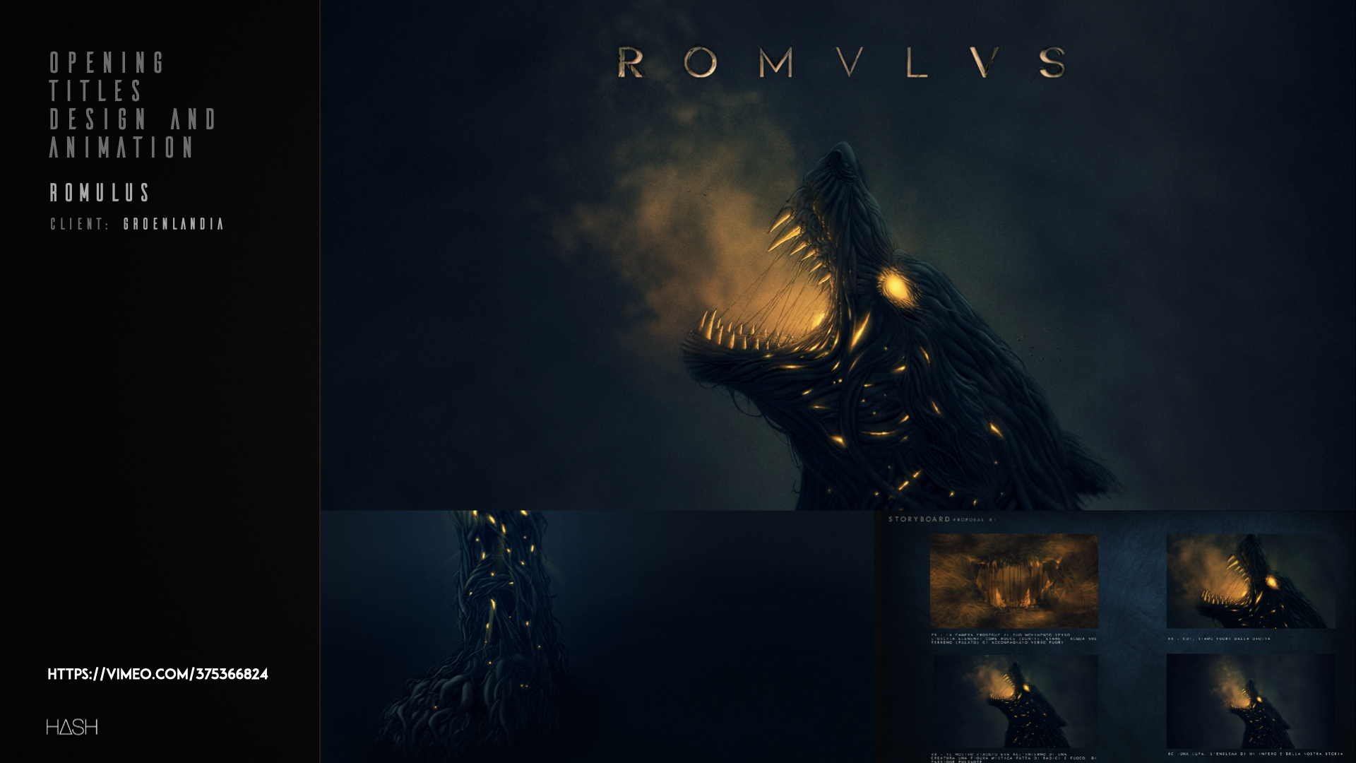
Romulus called for typography that did not look written but found. The lettering was drawn as if carved out of raw matter: stone, earth, unfinished metal, with edges that still carry the mark of the tool.
The animation works by subtraction: no decorative movement, only the appearance of the mark as if it were surfacing from within. The result holds together the brutality of the show's archaic world and the legibility a broadcast title needs.
Credits
- Title
- Romulus
- Client
- Groenlandia
- Discipline
- Opening titles design and animation
Working with us
If you are shaping a project with similar needs, the fastest way to find out whether we can help is to tell us about it.
Talk to us about your project